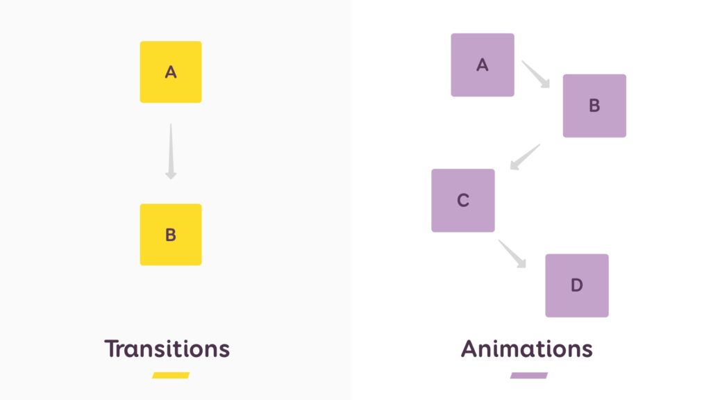
Welcome, fellow web wizards! Today, we delve into the realm of magic: the Power of CSS Animations and Transitions! Forget static pages; we’re about to breathe life into your website, adding dynamic elements that dance, twirl, and captivate your audience. Prepare to unleash your inner animator and transform your online space into a mesmerizing spectacle!
Breathe Life into Your Website: Unleashing the Power of CSS Animations and Transitions
Imagine your website as a stage, but instead of actors, we have elements. Wouldn’t it be amazing to see them glide across the screen, fade in and out with dramatic flair, or even morph into something entirely new? That’s the power of CSS animations and transitions!

Animations:
- The spotlight thief: Make elements pirouette, slide, or even bounce into view, drawing attention and emphasizing key points.
- The storytelling tool: Use animations to tell a story, simulate real-world movement, or create engaging visual effects.
- The user delight: Add a touch of whimsy and surprise with subtle animations, making your website a joy to explore.
Transitions:
- The smooth operator: Elevate user experience with seamless transitions between pages, menus, or any element that changes state.
- The visual storyteller: Use transitions to guide users’ attention, highlight changes, and create a sense of flow.
- The branding booster: Design custom transitions that reflect your brand personality and add a touch of uniqueness.
But wait, there’s more! CSS offers a toolbox of animation and transition properties:
animation: Define the duration, timing, and behavior of an animation, from simple fades to complex choreography.transition: Control how elements change between states, from smooth ease-in/ease-out to dramatic snaps and jumps.transform: Bend reality! Scale, rotate, skew, and manipulate elements to create mesmerizing effects.
Below is a simple example of CSS code demonstrating animation, transitions, and transformations:
<!DOCTYPE html>
<html lang="en">

<head>
  <meta charset="UTF-8">
  <meta name="viewport" content="width=device-width, initial-scale=1.0">
  <style>
    /* Animation Example */
    @keyframes fadeInOut {
      0% {
        opacity: 0;
      }

      50% {
        opacity: 1;
      }

      100% {
        opacity: 0;
      }
    }

    .animated-element {
      animation: fadeInOut 4s infinite; /* Animation lasts for 4 seconds and repeats indefinitely */
    }

    /* Transition Example */
    .transition-element {
      width: 100px;
      height: 100px;
      background-color: #3498db;
      transition: width 1s ease-in-out;
    }

    .transition-element:hover {
      width: 200px;
    }

    /* Transform Example */
    .transform-element {
      width: 100px;
      height: 100px;
      background-color: #e74c3c;
      transition: transform 0.5s ease-in-out;
    }

    .transform-element:hover {
      transform: rotate(45deg) scale(1.5);
    }
  </style>
  <title>Animation, Transition, and Transform Example</title>
</head>

<body>
  <!-- Animation Example -->
  <div class="animated-element">I am an animated element</div>

  <!-- Transition Example -->
  <div class="transition-element">Hover to expand</div>

  <!-- Transform Example -->
  <div class="transform-element">Hover to transform</div>
</body>

</html>
Remember, animations and transitions are not just toys. They can improve user experience, enhance engagement, and even tell a story. Use them wisely, strategically, and avoid overdoing it – you wouldn’t want your website to become a disco dance floor on overdrive!
So, grab your virtual wand and start animating! Experiment with different properties, explore creative possibilities, and find the perfect blend of animation and transition magic for your website. Remember, a little sprinkle of movement can go a long way!
Don’t forget to share your animated creations and ask questions in the comments below! We’re here to cheer you on as you become a CSS animation and transition master!
Subscribe to our blog for more CSS tutorials and tips, and together, let’s bring our websites to life with the power of animation and transition!


