Welcome back, fellow web warriors! Today, we delve into the realm of visual intrigue: the Power of Borders and Shadows in CSS! Prepare to ditch the flat, one-dimensional look and unleash your inner artist, adding depth, dimension, and personality to your website elements like never before.
The Power of Borders and Shadows in CSS
Imagine your website as a collection of flat, lifeless boxes. Not very exciting, right? Borders and shadows are your magic tools, transforming these boxes into vibrant, eye-catching elements that sing with visual flair.
Imagine your website as a blank sheet of paper. Sure, words can be written on it, but it lacks personality, it lacks character. That’s where borders and shadows come in, like magic spells that inject visual interest and make your website leap off the screen.
Borders: The Line of Distinction
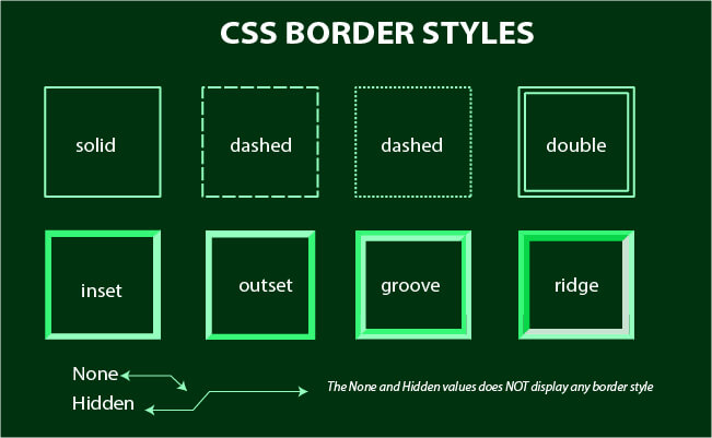
Think of borders as the outlines of your elements, adding a touch of separation and definition. With CSS, you can:
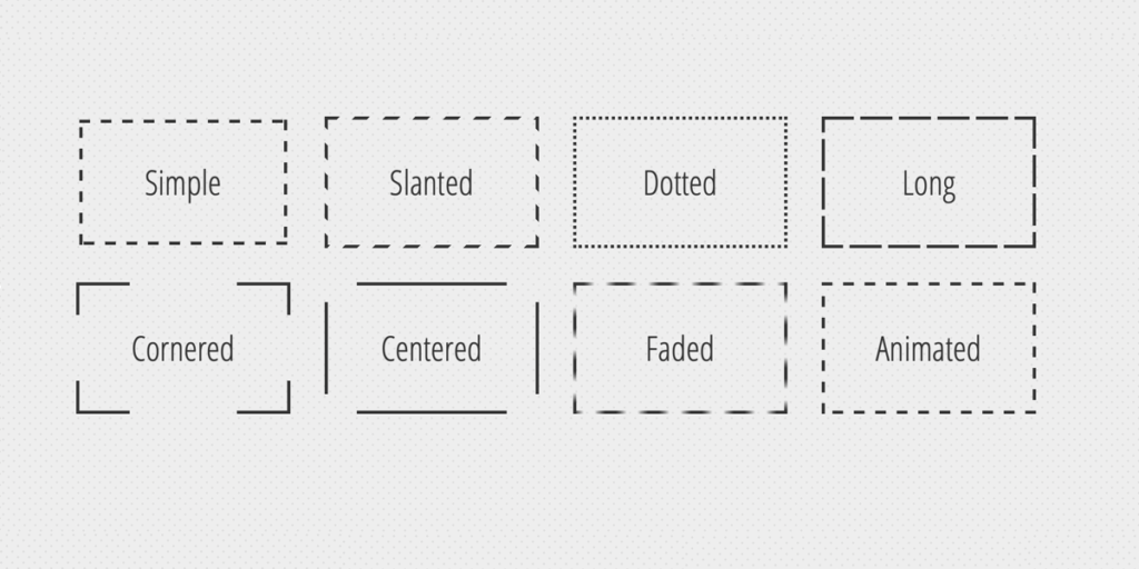
- Style the border: Choose from solid lines, dotted patterns, or even decorative dashes for a unique touch.
- Control the thickness: From subtle hairlines to bold statements, adjust the thickness to match the importance of your element.
- Set the color: Match your brand palette, create contrasting accents, or even use gradients for a dynamic effect.


Shadows: Whispers of Depth and Dimension
But borders are just the beginning! Shadows add a touch of mystery and intrigue, making your elements appear to float off the page. You can:
- Control the direction: Cast shadows behind, to the side, or even diagonally to create a sense of movement and depth.
- Adjust the blur: Soft shadows for subtle hints or bold blurs for dramatic impact.
- Set the color: Match your borders, create contrasting effects, or even experiment with transparent shadows for a subtle glow.
Beyond the Basics:
Combine these tools for even more creative magic:
- Inner shadows: Add depth from within, like a spotlight highlighting an element.
- Box-shadow: Embrace the all-in-one solution, combining border and shadow styles for a complete makeover.
- Responsive design: Adapt your borders and shadows to different screen sizes, ensuring a seamless experience on all devices.
 @media only screen and (max-width: 600px) {
      /* Styles for screens smaller than 600px */
      header, footer {
        font-size: 14px;
      }
Remember, borders and shadows are not just cosmetic. They can:
- Improve accessibility: Well-defined borders and shadows help users distinguish between elements, especially for visually impaired individuals.
- Enhance user experience: Subtle shadows can guide the eye through your content, while bold borders can highlight important calls to action.
- Boost brand identity: Carefully chosen styles can reflect your brand personality and create a cohesive visual language.
So, grab your virtual paintbrush and unleash your creativity! Experiment with borders and shadows, explore their potential, and transform your website elements into captivating visual masterpieces. Remember, the only limit is your imagination!
- Improve accessibility: High-contrast borders can benefit users with visual impairments.
- Enhance hierarchy: Use borders and shadows to visually separate important elements from less crucial ones.
- Guide the user’s eye: Draw attention to specific sections or call to actions with strategically placed borders and shadows.
Don’t forget to share your border and shadow creations and ask questions in the comments below! We’re here to support you on your journey to becoming a CSS visual maestro!
Subscribe to our blog for more CSS tutorials and tips, and together, let’s paint the web with shadows and dimension!


